December 13, 2000 - February 10, 2001
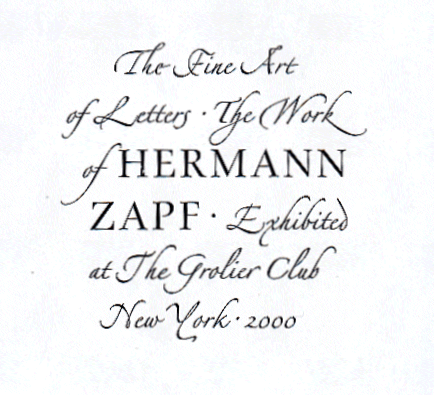
The Fine Art of Letters: The Work of Hermann Zapf
Curated by Jerry Kelly
Perhaps no one in the twentieth-century has had more of an influence in the fields of type design, calligraphy, and typography than the noted German designer Hermann Zapf. From his first typeface in 1938 (Gilgengart) through more than 200 others right up to the present day, Zapf's work has achieved an unmatched popular success, while maintaining an aesthetic level which has earned him praise from connoisseurs throughout the world. Several of his most popular type designs, such as Palatino, Optima, Zapf Chancery, and Zapf Dingbats, are resident on most home computers. Other fonts, such as Michelangelo, Zapf International, and Zapf Renaissance - among numerous others - are the mainstay of many of the finest graphic designers of today.
In addition to his work in type design, Zapf is probably the most noted calligrapher of the past fifty years. His manual of calligraphic styles,
Pen and Graver (1949), set a standard that has been admired by several generations of calligraphers. His work in the field of calligraphy, including original broadsides, dust jackets for various publishers, limited edition silk-screen prints, and his innovative "sgraffito" technique painted calligraphic panels, have been reproduced widely, bringing calligraphy to the level of a fine art.
While less known, Zapf's typography and book design have also been influential. His two
Manuales (1954 and 1968), each containing 100 inventive arrangements of various typefaces, are classics of their kind. Other Zapf publications, such as
Typographic Variations (1963),
Orbis Typographicus (1984), and
Poetry Through Typography (1992), display a stunning range of typographic dexterity. Book designs, mainly for major German publishers such as Suhrkamp, S. Fischer, Insel, and others - many of which won coveted "Most Beautiful Books of the Year" awards - will also be shown.
Hermann Zapf was born in Nuremburg, Germany in 1918. The political situation of his youth made it very difficult for Zapf, whose father was dismissed from his job by the Nazis. After the war Zapf was employed by the famous Stempel Typefoundry in Frankfurt and the German division of the Linotype Corporation, for both of whom he produced some of his finest type designs; as well as art-directing type specimens which will be on display at the Grolier Club. Throughout the 1960s and 1970s Zapf was mainly a free-lance designer, with important work being done for International Typeface Corporation, URW, Hell-Digiset; Hallmark Cards; and numerous other major clients. His Marconi typeface design of 1972 was the very first alphabet designed specifically for digital composition; today virtually all type - from home computer fonts to sophisticated typesetting systems - is digitally generated.
In the 1970s and 1980s Zapf expanded his teaching, including ten years of special sessions at the Rochester Institute of Technology. In the past couple of decades he produced several more important books, such as
Hermann Zapf & His Design Philosophy and
From the Hand of Hermann Zapf. Since 1972 he has lived in Darmstadt, Germany with his wife, Gudrun Zapf-von Hesse, herself a noted type designer and calligrapher.
Along with highlights from throughout Zapf's career as a type designer, calligrapher, and typographer, the Grolier Club exhibition will display some exceptionally rare examples of Zapf's oeuvre, many of which have rarely or never been displayed before. An illustrated catalogue on Zapf's work, also containing much previously unpublished work, and with an introduction by curator Jerry Kelly, will be published in a limited edition to accompany the show.